In this post I showed a visualization of the organizational network of my department. Since several people asked for details how the plot has been produced, I will provide the code and some extensions below. The plot has been done entirely in R (2.14.01) with the help of the igraph package. It is a great package but I found the documentation somewhat difficult to use, so hopefully this post can be a helpful introduction to network visualization with R. Here we go:
# Load the igraph package (install if needed)require(igraph)# Data format. The data is in 'edges' format meaning that each row records a relationship (edge) between two people (vertices). # Additional attributes can be included. Here is an example: # Supervisor Examiner Grade Spec(ialization) # AA BD 6 X # BD CA 8 Y # AA DE 7 Y # ... ... ... ... # In this anonymized example, we have data on co-supervision with additional information about grades and specialization. # It is also possible to have the data in a matrix form (see the igraph documentation for details) # Load the data. The data needs to be loaded as a table first:bsk<-read.table("http://www.dimiter.eu/Data_files/edgesdata3.txt", sep='\t', dec=',', header=T)#specify the path, separator(tab, comma, ...), decimal point symbol, etc. # Transform the table into the required graph format:bsk.network<-graph.data.frame(bsk, directed=F)#the 'directed' attribute specifies whether the edges are directed # or equivelent irrespective of the position (1st vs 2nd column). For directed graphs use 'directed=T' # Inspect the data:V(bsk.network)#prints the list of vertices (people)E(bsk.network)#prints the list of edges (relationships)degree(bsk.network)#print the number of edges per vertex (relationships per people) # First try. We can plot the graph right away but the results will usually be unsatisfactory:plot(bsk.network)
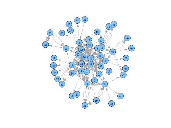
Not very informative indeed. Let’s go on:
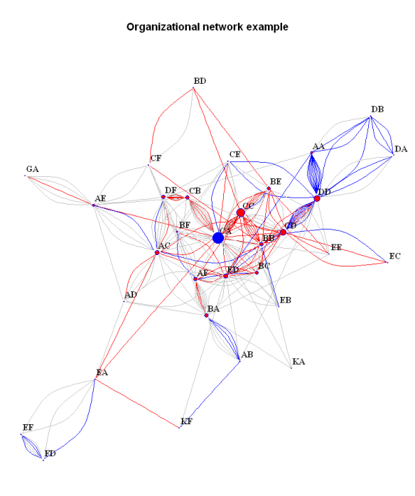
#Subset the data. If we want to exclude people who are in the network only tangentially (participate in one or two relationships only) # we can exclude the by subsetting the graph on the basis of the 'degree':bad.vs<-V(bsk.network)[degree(bsk.network)<3]#identify those vertices part of less than three edgesbsk.network<-delete.vertices(bsk.network, bad.vs)#exclude them from the graph # Plot the data.Some details about the graph can be specified in advance. # For example we can separate some vertices (people) by color:V(bsk.network)$color<-ifelse(V(bsk.network)$name=='CA', 'blue', 'red')#useful for highlighting certain people. Works by matching the name attribute of the vertex to the one specified in the 'ifelse' expression # We can also color the connecting edges differently depending on the 'grade':E(bsk.network)$color<-ifelse(E(bsk.network)$grade==9, "red", "grey")# or depending on the different specialization ('spec'):E(bsk.network)$color<-ifelse(E(bsk.network)$spec=='X', "red", ifelse(E(bsk.network)$spec=='Y', "blue", "grey"))# Note: the example uses nested ifelse expressions which is in general a bad idea but does the job in this case # Additional attributes like size can be further specified in an analogous manner, either in advance or when the plot function is called:V(bsk.network)$size<-degree(bsk.network)/10#here the size of the vertices is specified by the degree of the vertex, so that people supervising more have get proportionally bigger dots. Getting the right scale gets some playing around with the parameters of the scale function (from the 'base' package) # Note that if the same attribute is specified beforehand and inside the function, the former will be overridden. # And finally the plot itself:par(mai=c(0,0,1,0))#this specifies the size of the margins. the default settings leave too much free space on all sides (if no axes are printed)plot(bsk.network,#the graph to be plottedlayout=layout.fruchterman.reingold,# the layout method. see the igraph documentation for detailsmain='Organizational network example',#specifies the titlevertex.label.dist=0.5,#puts the name labels slightly off the dotsvertex.frame.color='blue',#the color of the border of the dotsvertex.label.color='black',#the color of the name labelsvertex.label.font=2,#the font of the name labelsvertex.label=V(bsk.network)$name,#specifies the lables of the vertices. in this case the 'name' attribute is usedvertex.label.cex=1#specifies the size of the font of the labels. can also be made to vary)# Save and export the plot. The plot can be copied as a metafile to the clipboard, or it can be saved as a pdf or png (and other formats). # For example, we can save it as a png:png(filename="org_network.png", height=800, width=600)#call the png writer #run the plotdev.off()#dont forget to close the device #And that's the end for now.
Still not perfect, but much more informative and aesthetically pleasing.
Additional information can be found on this guide to igraph which is in development, the examples here, and the official CRAN documentation of the package. Especially useful is this list of the plot attributes that can be tweaked. The plots can also be adjusted interactively using the tkplot function instead of plot, but the options for saving the resulting figure are limited.
Have fun with your networks!


