Well, well…
I have now rebranded and transferred this blog to a new location on my own domain. You can continue following and reading at the new address: http:/re-design.dimiter.eu
See you there!
Well, well…
I have now rebranded and transferred this blog to a new location on my own domain. You can continue following and reading at the new address: http:/re-design.dimiter.eu
See you there!
Migration is quickly turning into the defining issue of our time. This might sound cliché, but is true. Not only does migration top the list of most important problems facing society, but it is also divisive in a way no other issue is. Unlike problems like inequality or the environment, immigration polarizes and divides opinions of ordinary people in a manner that cuts through social classes, education levels, age groups, and political affiliations. Divisions and bitter disagreements run even within families and close circles of friends. For no other issue do I see on my Facebook wall the full gamut of opinions ranging from strong rejection of migrants and refugees to their unconditional welcome and embrace. Most opinions of course fall somewhere in-between expressing, for example, support for `genuine’ refugees fleeing war but not for economic migrants, or for Christian but not for Muslim immigrants; yet, deep and important disagreements remain.
The current crisis with the influx of hundreds-of-thousands asylum-seekers in Europe in the summer of 2015 is only but the current episode of the unfolding migration drama. The crisis and the political responses to it bring powerful emotions in people: fear and compassion, anger and humility, empathy and contempt. Together with polarization, emotions further cloud the discussion of asylum policies and the right thing for the European countries to do in this situation. In response, I want to share five simple things I happen to know about asylum policies in the EU. I am by no means a specialist on the legal aspects of asylum or migration law. My expertise comes from two rather technical policy studies I have conducted on the aggregate patterns of asylum applications and country refugee recognition rates over the last decade, and on their relationships with the broader social and political contexts. (see here and here for the academic articles and here for a blogpost and visualization based on them)
1) The asylum policies of the countries members of the European Union still differ a lot. Despite a considerable body of EU legislation harmonizing national asylum policies, in effect these national policies have not converged to a common set of standards and rules. The differences concern the handling of asylum application procedures (e.g. their duration), the actual support provided by the state to the applicants during the procedure, the quality of the reception facilities, the rights and privileges gained after (and if) a refugee status is granted, the forms of alternative protection if a refugee status is not granted, and what happens to those who are refused any protection. Most importantly of all, however, the EU member states differ significantly with respect to their recognition rates (the share of applications that are granted the refugee status) even for applicants from the same country of origin. By implication, this means that different states apply rather different criteria when assessing the asylum applications.
These differences are crucial to understand why a joint common EU asylum application center does not seem politically feasible at the moment and is not even being discussed as an option to respond to the current crisis. Until such considerable differences exist, a truly single European policy on asylum would remain out of sight.
2) The strictness of national policies towards asylum-seekers matter relatively little for the asylum flows they receive. You can think that by tightening their asylum policies – making reception conditions worse, reducing support during the application and after, or lowering the recognition rate, countries can lessen the asylum application burden that they face. But in fact asylum flows tend to be relatively insensitive and unresponsive, at least in the short and medium terms, to the strictness of national asylum policies and to how low or high the national recognition rates are. So manipulating national policy is not an effective tool to divert (or attract) asylum application flows. The same goes for the effect of current economic conditions or the political climate in a country (for example, whether there is broad public and party support or opposition to migrants). Asylum flows are directed to a large degree by geographical convenience and existing transit networks, by hearsay and stereotypes to be affected by the details of national asylum policies or recognition rates. The implication of all that is that no single country can unilaterally isolate itself from the asylum flows coming to Europe. That being said, because asylum flows are highly clustered (see below), not being on what is at the moment the most convenient route to Western and Northern Europe can dramatically affect the number of asylum-seekers that pass through or end up in your country.
3) Asylum-seekers from the same nationality or region tend to cluster in particular places. Not only do asylum-seekers from the same region or country tend to travel on the same routes employing the same networks and middlemen, but they also tend to cluster when and where they choose a place to lodge an application and where they settle if allowed. These points are quite intuitive. Extended family ties and networks provide for crucial information about handling the asylum-application process and about the living and working conditions in the host country and city. They also provide support and protection, etc. So no wonder that new asylum-seekers and refugees try to go to where they family and friends already are.
What is important to recognize, however, are the not so obvious policy implications of the fact that asylum-seekers and refugees cluster in space. Because migrants would tend to congregate in few places, these places would be subject to a much greater asylum burden than others. This goes for countries, but also for cities and regions within countries.
That is why countries are reluctant to let asylum-seekers and refugees settle wherever they wish in the EU. Otherwise, the fear is that because of the attracting power of existing networks of relatives and compatriots, very few places will have to deal with the challenges of supporting and integrating a great proportion of the refugees. The call for mandatory country (and existing regional within-country) quotas are partly responding to these expectations.
4) Even when recognized as such, refugees do not enjoy a freedom of movement in the EU. As mentioned above, refugees (and asylum-seekers) are not allowed to move, reside and work freely within the EU, unlike citizens of its member states. Even though recognized refugees might have the rights to work and live in the country that has recognized their status and even benefit from the national social protection policies, they cannot choose to relocate to another member states. This is important in order to understand why it is so crucial for the asylum-seekers to reach the desired place in Europe before they lodge an application.
But it is also important to understand why the compulsory re-settlement based on country quotas that the European Commission proposes would likely not work. Even if adopted by the Council (which at the moment seems rather unlikely), the scheme would run into troubles the moment the refugees try to skip their imposed host countries and go to where their family and support networks are. And they will. The resettlement quote scheme would then have to be coupled with measures like compulsory self-reporting or tagging that would allow for tracing the location of refugees and asylum seekers. Such measures would not only by expensive, but morally objectionable as well.
5) Even when their requests for asylum are rejected, asylum seekers often stay in Europe. This is the dirty little secret of asylum policy in Europe. Even when an asylum application has been rejected, and even when other forms of alternative protection are not granted, the migrants are rarely sent back to their country of origin. They either disappear into illegality but never leave the continent or exist in a para-legal limbo where their presence is tolerated but no support is provided. European countries differ in the extent to which they allow this to happen, and it is hard to get precise numbers about the scale of the problem, but it is in any case huge. Alternatives are, however, hard to find as locating and sending people back to their country of origin is expensive, often impossible if the migrants lack proper documents, and, many would argue, morally objectionable. But this fact undermines the idea that asylum-seekers are a special group of migrants who are only allowed to stay in the country if they face serious threats for their lives and dignity at home. If those who are rejected are allowed or tolerated to stay anyways, the difference between an asylum-seeker and a migrant motivated by economic or other reasons is much hard to draw in the public mind. Note that I am not saying that people migrating for reasons others than fleeing wars and persecution should not be welcomed; only that many people have different attitudes and policy preferences with respect to different groups of migrants, and that blurring the boundaries between the groups can have negative consequences for people’s selective support of particular groups, like refugees.
All in all, none of these five points suggest a comprehensive solution to the current asylum crisis or point to a clear way forward. What they do, hopefully, is to outline some of the facts and constraints that those in power must have in mind when designing responses to the situation and some arguments with which the judge existing proposals.
To put my cards on the table, I currently think that a combination of three policies can be preferable to the current system and to existing proposals:
This would represent a rather drastic change from the system currently in place so it probably has low political feasibility. At the same time, current proposals do not seem to fare much better in the EU decision-making bodies, so the scale of required changes should be no reason to disregard the ideas.
The results from the British elections last week already claimed the heads of three party leaders. But together with Labour, the Liberal Democrats and UKIP, there was another group that lost big time in the elections: pollsters and electoral prognosticators. Not only were polls and predictions way off the mark in terms of the actual vote shares and seats received by the different parties. Crucially, their major expectation of a hung parliament did not materialize as the Conservatives cruised into a small but comfortable majority of the seats. Even more remarkably, all polls and predictions were wrong, and they were all wrong pretty much in the same way. Not pretty.
This calls for reflection upon the exploding number of electoral forecasting models which sprung up during the build-up to the 2015 national elections in the UK. Many of these models were offered by political scientists and promoted by academic institutions (for example, here, here, and here). At some point, it became passé to be a major political science institution in the country and not have an electoral forecast. The field became so crowded that the elections were branded as ‘a nerd feast’ and the competition of predictions as ‘the battle of the nerds’. The feast is over and everyone lost. It is the time of the scavengers.
The massive failure of British polls and predictions has already led to a frenzy of often vicious attacks on the pollsters and prognosticators coming from politicians, journalists and pundits, in the UK and beyond. A formal inquiry has been launched. The unmistakable smell of schadenfreude is hanging in the air. Most disturbingly, some respected political scientists have voiced a hope that the failure puts a stop to the game of predicting voting results altogether and dismissed electoral predictions as unscientific.


This is wrong. Political scientists should continue to build predictive models of elections. This work has scientific merit and it has public value. Moreover, political scientists have a mission to participate in the game of electoral forecasting. Their mission is to emphasize the large uncertainties surrounding all kinds of electoral predictions. They should not be in the game in order to win, but to correct on others’ too eager attempts to mislead the public with predictions offered with a false sense of precision and certainty.
The rising number of electoral forecasts done by political scientists has more than a little bit to do with a certain jealousy of Nate Silver – the American forecaster who gained international fame and recognition with his successful predictions of the US presidential elections. (By the way, this time round, Nate Silver got it just as wrong as the others). For once, there was something sexy about political science work, but the irony was, political scientists were not part of it. And if Nate, who is not a professional political scientist, can do it, so can we – academic experts with life-long experience in the study of voting and elections and hard-earned mastery of sophisticated statistical techniques. So the academia was drawn into this forecasting thing.
And that’s fine. Political scientists should be in the business of electoral forecasting because this business is important and because it is here to stay. News outlets have an insatiable appetite for election stories as voting day draws near, and the release of polls and forecasts provides a good excuse to indulge in punditry and sometimes even meaningful discussion. So predictions will continue to be offered and if political scientists move away somebody else will take their place. And the newcomers cannot be trusted to have the public interest at heart.
Election forecasts are important because they feed into the electoral campaign and into the strategic calculations of political parties and of individual voters. Voting is rarely an act of naïve expression of political preferences. Especially in an electoral system that is highly non-proportional, as the one in the UK, voters and parties have a strong incentive to behave strategically in view of the information that polls and forecasts provide. (By the way, ironically, the one prognosis that political scientists got relatively right – the exit poll – is the one that probably matters the least as it only serves to satisfy our impatience to wait a few more hours for the official electoral results.)
Hence, political scientists as servants of the public interest have a mission to offer impartial and professional electoral forecasts based on state of the art methodology and deep substantive knowledge. They must also discuss, correct and when appropriate trash the forecasts offered by others.
And they have one major point to make – all predictions have a much larger degree of uncertainty than what prognosticators want (us) to believe. It is a simple point that experience has been proven right times and again. But it is one that still needs to be pounded over and over as pollsters, forecasters and the media get easily carried away.
It is in this sense that commentators are right: predictions, if not properly bracketed by valid estimates of uncertainty, are unscientific and pure charlatanry. And it is in this sense that most forecasts offered by political scientists at the latest British elections were a failure. They did not properly gauge the uncertainty of their estimates and as a result misled the public. That they didn’t predict the result is less damaging than the fact they pretended they could.
Since the bulk of the data doing the heavy-lifting in most electoral predictive models is poll data, the failure of prediction can be traced to a failure of polling. But pollsters cannot be blamed for the fact that prognosticators did not adjust the uncertainty estimates of their predictions. The tight sampling margins of error reported by pollsters might be appropriate to characterize the uncertainty of polling estimates (under certain assumptions) of public preferences at a point in time, but they are invariably too low when it comes to making predictions from these estimates. Predictions have other important sources of uncertainty in addition to sampling error and by not taking these into account prognosticators are fooling themselves and others. Another point forecasters should have known: combining different polls reduces sampling margins of error, but if all polls are biased (as they proved to be in the British case), the predictions could still be seriously off the mark.
Offering predictions with wide margins of uncertainty is not sexy. Correcting others for the illusory precision of their forecasts is tedious and risks being viewed as pedantic. But this is the role political scientists need to play in the game of electoral forecasting, and being tedious, pedantic and decidedly unsexy is the price they have to pay.
[Note: re-post from Eurosearch]
Combining political, demographic and economic data for the local level in the UK, we find that the presence of immigrants from Central and Eastern Europe (CEE) is related to higher voting shares cast for parties with Eurosceptic positions at the 2014 elections for the European Parliament. Evidence across Europe supports the connection between immigration from CEE and the electoral success of anti-Europe and anti-immigration political parties.
Immigration has become the top political issue in the UK. It played a pivotal role during the European Parliament elections in 2014 and it is the most-talked about issue in the build-up to the national elections in 2015.
The arrival of Eastern Europeans in the wake of the ‘Big Bang’ EU enlargement in 2004 and 2007 has a large part of the blame to take for the rising political salience of immigration for the British public. Figure 1 shows that ever since the EU accession of the first post-communist countries in 2004, immigration has been considered one of the two most important issues facing the country by a substantial proportion of British citizens, surpassing even concerns about the economy, except for the period between 2008 and 2012.
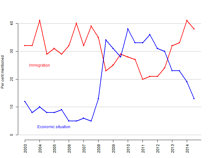
Data source: Standard Eurobarometer (59 to 82).
These popular concerns have swiftly made their way into the electoral arena. Some political parties like UKIP and BNP have taken strong positions in favor of restricting immigration and against the process of European integration in general. Others, like the Conservative party, have advocated restricting access of EU immigrants to the British labour market[5] while retaining an ambivalent position towards the EU. Parties with positions supportive of immigration and European integration have altogether tried to dodge the issues for fear of electoral punishment. Arguably, political and media attention to immigration (and East European immigrants in particular) have acted to reinforce the public concerns. In short, British voters care about and fear immigration, and political parties have played to, if not orchestrated, the tune.
But there is more to this story. In recent research we find evidence that higher actual levels of immigration from Central and Eastern Europe (CEE) at the local level in the UK are related to higher shares of the vote cast for Eurosceptic parties at the last European Parliament elections in 2014. In other words, British Eurosceptic parties have received, on average and other things being equal, more votes in localities with higher relative shares of East European residents.
The relationship is not easy to uncover. Looking directly into the correlation between relative local-level CEE immigration population shares and the local vote shares of Eurosceptic parties would be misleading. Immigrants do not settle randomly, but take the economic and social context of the locality into account. At the same time, this local economic and social context is related to the average support for particular parties. For example, local unemployment levels are strongly positively correlated with the vote share for the Labour party, and the local share of highly educated people is strongly positively correlated with the vote share for the Greens (based on the 2014 EP election results). Therefore, we have to examine the possible link between CEE immigration shares and the vote for Eurosceptic parties net of the effect of the economic and social local contexts which, in technical terms, potentially confound the relationship.
In addition, immigrants themselves can vote at the EP elections and they are more likely to vote for EU-friendly parties. This would tend to attenuate any positive link between the votes of the remaining local residents and support for Eurosceptic parties. Lastly, the available local level immigration statistics track only immigrants who have been in the country longer than three months (as of 27 March 2011). Hence, they miss more recent arrivals, seasonal workers and immigrants who have not been reached by the Census at all. All these complications stack the deck against finding a positive relationship between the local presence of CEE immigrants and the vote for Eurosceptic parties. It is thus even more remarkable that we do observe one.

Figure 2 shows a scatterplot of the logged share of CEE immigrants from the local level population as of 2011 (on the horizontal axis) against the residual share of local level vote shares of Eurosceptic parties (UKIP and BNP) at the 2014 EP election (on the vertical axis). Each dot represents one locality (lower-tier council areas in England and unitary council areas in Wales and Scotland) and the size of the dot is proportional to the number of inhabitants. A few localities are labeled. The voting share is residual of all effects of the local unemployment level, and the relative shares of highly educated people, atheists, and non-Western immigrants in the population. In other words, the vertical axis shows the proportion of the vote for Eurosceptic parties unexplained by other social and economic variables.
The black straight line that best fits all observations is included as a guide to the eye. Its positive slope indicates that, on average, higher shares of CEE immigrants are related with higher Eurosceptic vote shares. Formal statistical tests show that the relationship is unlikely to be due to chance alone.
While the link is discernable from random fluctuations in the data, it is far from deterministic. Some of the localities with the highest relative shares of CEE immigrants, like Brent, have in fact only moderate Eurosceptic vote shares, and some localities with the highest share of the vote cast for Eurosceptic parties, like Hartlepool, have very low registered presence of CEE immigrants. Nevertheless, even if it only holds on average, the relationship remains substantially important.
Does this mean that people born in the UK are more likely to vote for Eurosceptic parties because they have had more contact with East Europeans? Not necessarily. Relationships at the level of individual citizens cannot be inferred from relationships at an aggregate level (otherwise, we would be committing what statisticians call ecological fallacy). In fact, there is plenty of research in psychology and sociology showing that direct and sustained contact with members of an out-group, like immigrants, can decrease prejudice and xenophobic attitudes. But research has also found that the sheer presence of an out-group, especially when direct contact is limited and the public discourse is hostile, can heighten fears and feelings of threat of the host population as well. Both mechanisms for the effect of immigration presence on integration attitudes – the positive one of direct contact and the negative one of outgroup presence – are compatible with the aggregate level relationship that we find. And they could well coexist – for a nice illustration see this article in the Guardian together with the comments section.
Is it really the local presence of immigrants from Central and Eastern Europe in particular that leads to higher support for Eurosceptic parties? It is difficult to disentangle the effects of CEE immigrants and immigrants from other parts of the world, as their local level shares share are correlated. Yet, the relative share of non-Western immigrants from the local population appears to have a negative association with support for Eurosceptic parties across a range of statistical model specifications, while the effect of CEE immigrants remains positive no matter whether non-Western immigration has been controlled for or not.
There is also evidence for an interaction between the presence of immigrants from CEE and from other parts of the world. The red line in Figure 2 is fitted only to the localities that have lower than the median share of non-western immigrants. It is steeper than the black one which indicates that for these localities the positive effect of CEE immigrants on Eurosceptic votes is actually stronger. The blue line is fitted only to the localities with lower than the median share of non-western immigrants. It is sloping in the other direction which implies that in localities with relatively high shares of immigrants from other parts of the world, the arrival of East Europeans does not increase the vote for Eurosceptic parties.
It is interesting to note the recent statement by UKIP leader Nigel Farage that he prefers immigrants from form former British colonies like Australia and India to East Europeans. Focusing rhetorical attacks on immigrants from CEE in particular fits and makes sense in light of the story told above.
We (with Elitsa Kortenska) also find that CEE immigration increases Euroscepticism at the local level in other countries as well. In a recently published article (ungated pre-print here) we report this effect in the context of the referenda on the ill-fate European Constitution in Spain, France, and The Netherlands in 2005 and on the Treaty of Lisbon in Ireland in 2008. In ongoing work we argue that local level presence of CEE immigrants is systematically related to higher vote shares cast for Eurosceptic parties in Austria, The Netherlands, and France, in addition to the British case discussed in this post.
Why does this all matter? The process of European integration presupposes the right of people to move and work freely within the borders of the Union. This is not only a matter of convenience, but of economic necessity. People from regions experiencing economic hardship must be able to move to other EU regions with growing economies for economic integration to function. In an integrated economy like the EU or the US, a Romanian or a Greek must be free to seek employment in the UK or in Poland the same way an American living in Detroit is able to relocate to California in search of work and fortune.
This is especially true given the lack of large-scale redistribution between EU regions. Economic Integration creates regional inequalities. One way to respond is to redistribute the benefits of integration. Another is to allow people and workers to move where employment chances are currently high. If none of these mechanisms is available, economic and political integration are doomed. Therefore, if immigration within the EU indeed fuels Euroscepticism, as our study suggests, the entire European integration project is at risk.
Note: of potential interest to R users for the dynamic Google chart generated via googleVis in R and discussed towards the end of the post. Here you can go directly to the graph.

An emergency refugee center, opened in September 2013 in an abandoned school in Sofia, Bulgaria. Photo by Alessandro Penso, Italy, OnOff Picture. First prize at World Press Photo 2013 in the category General News (Single).
The tragic lives of asylum-seekers make for moving stories and powerful photos. When individual tragedies are aggregated into abstract statistics, the message gets harder to sell. Yet, statistics are arguably more relevant for policy and provide for a deeper understanding, if not as much empathy, than individual stories. In this post, I will offer a few graphs that present some of the major trends and patterns in the numbers of asylum applications and asylum recognition rates in Europe over the last twelve years. I focus on two issues: which European countries take the brunt of the asylum flows, and the link between the application share that each country gets and its asylum recognition rate.
Asylum applications and recognition rates
Before delving into the details, let’s look at the big picture first. Each year between 2001 and 2012, 370,000 people on average have applied for asylum protection in one of the member states of the European Union (plus Norway and Switzerland). As can be seen from Figure 1, the number fluctuates between 250,000 and 500,000 per year, and there is no clear trend. Altogether, during this 12-year period, approximately 4.5 million people have applied for asylum, which makes slightly less than one percent of the total EU population. Of course, this figure only tracks people who have actually made it to the asylum centers and filed an application – all potential refugees who have perished on the way, or have arrived but been denied the right of formal application, or have remained clandestine are not counted.

Figure 1 also shows the annual number of persons actually recognized as ‘refugees’ under the terms of the Geneva Convention by the European governments: a status which grants considerable rights and protection. This number is quite lower with an average of around 40.000 per year (in the EU+ as a whole) which makes for less than half-a-million in total for the 12 years between 2001 and 2012. While the overall recognition rate remains between 7% and 14%, there is considerable variation between the different European states both in the share from the asylum flows they receive, and in the national asylum recognition rates.
Who takes the brunt of the asylum burden?
Both the asylum flows and the recognition rates are in fact distributed highly unequally across the continent, and in a way that cannot be completely accounted for by the wealth of destination countries, former (colonial) ties between asylum sources and destinations, nor geographical distance. To compare the shares of the total European pool of asylum applications and recognitions that a destination country gets, I create the so-called ‘burden coefficient’. The ‘burden coefficient’ compares the actual share of asylum applications a country received in a year to its ‘fair’ share which is defined as its relative share of the annual total EU+ GDP. Simply put, if a country accounts for 10% of the European GDP, it would have been expected to receive 10% of all asylum applications filed in Europe that year. Taking account of GDP adjusts the raw asylum application shares in view of the expectation that richer and more populous countries should bear a proportionally higher share of the total European asylum ‘burden’ than poorer and smaller states.

Figure 2 shows the (logged) burden coefficient for asylum application shares for each EU+ country, averaged over the period 2010-2012. The solid line at zero indicates an asylum applications share perfectly proportional to a country’s GDP share (a ‘fair’ burden). Countries with positive values receive a higher share of all applications than implied by their GDP level, and countries with negative values receive a lower than their implied share. (The dotted lines show where a country that is doing twice as much / twice as little as expected would be). Clearly, Spain, Portugal, Italy and many (but not all) of the East European countries underdeliver while Cyprus, Malta, Greece, and several West European states (notably Sweden, Belgium, and Norway) take a disproportionately high share of the total pool of asylum applications filed in Europe over the last few years. Note that these comparisons already take into account (correct for) the fact that most of the Southern and Eastern European countries are poorer (have lower GDP) than the ones in the Western and Northern parts of the continent.

The picture does not change much when we focus on actual asylum recognitions (under the terms of the Geneva Convention) instead of applications. Figure 3 shows the burden coefficient (again averaged over 2010-2012) for full status refugee recognitions in Europe. The country ranking is similar with a few important exception – Greece grants much fewer asylum recognitions than expected even after we account for the state of its economy; Austria and Switzerland join the ranks of states which do much more than their implied share; and, sadly, many more countries in fact underdeliver when it comes to full refugee status grants. (Note that some states offer alternative protection to those denied the full ‘Geneva Convention’ status but the forms and level of this protection differs significantly across the continent).
Are asylum application shares responsive to the recognition rate?
Given these rather significant discrepancies across Europe in how many asylum applications countries get, and how much protection they offer, it is natural to ask whether the applications shares and the recognition rates are in fact related. Do asylum seekers flock at the gates of the European states which are most generous in their recognition policy? Do low recognition rates deter potential refugees from applying in certain countries? Can the strictness of asylum policy be an effective policy tool shaping future application flows? A comprehensive statistical analysis shows that while application shares and recognition rates are associated, their responsiveness to each other is rather weak. Simply put, manipulating the recognition rates is unlikely to have big practical effects on the asylum application share a country receives, and changes in the applications rates only weakly affect state recognition rates. The details of the analysis are rather technical and can be found here, but a dynamic visualization can help illustrate the patterns.
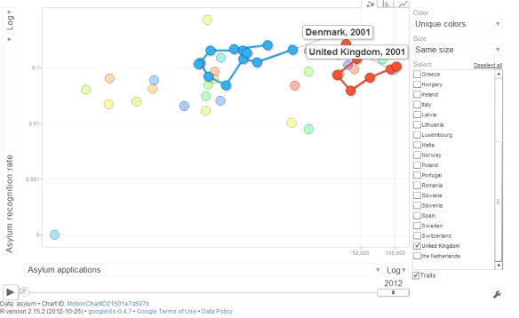
The dynamic interactive chart linked here shows the relationship between asylum applications and asylum recognition rates for each EU+ country over the last 12 years (the chart cannot be embedded in this post due to WordPress policy, but there is a screenshot below). When you press ‘Play’ each dot traces the experience of one country over time. You can choose to observe all, select a single state to focus upon, or tick a couple to compare their experiences.
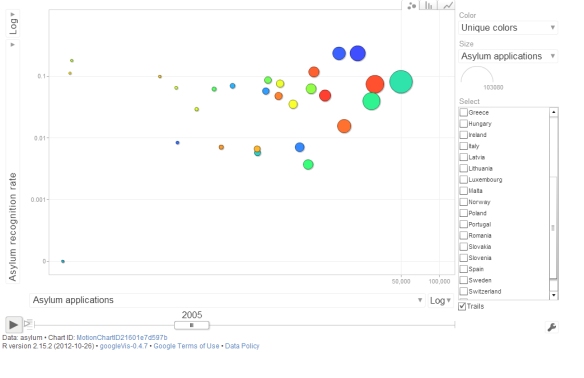
A movement of a dot (and the trace in leaves) in a horizontal direction means that the number of asylum applications received by a country increases while the recognition rates remains the same. Similarly, a vertical move implies a change in the recognition rate but a stable asylum application flow. A trajectory that follows a diagonal suggests a link between applications and recognition rates.
When paused, the state of the chart at each year shows the cross-sectional association between applications and recognition rates: it is easy to see that there is a (rather stable) weakly-strong positive relationship. But the trajectories of individual countries over time do not suggest that there is a temporal link between the two aspects of asylum policy for particular countries. For example, in the UK between 2001 and 2004 both the recognition rates and the applications fall, which would suggest strong responsiveness, but then the recognition rate moves up from 4% to almost 30% without any significant increase in applications. The trajectory of Denmark (try it out) exhibits something close to a dynamic link with rates depressing applications initially but then when they rise again, applications seem to pick up as well. Of course, asylum flows are driven by many other factors as well, so while suggestive, the patterns in the chart should be interpreted with care.
More comprehensive analyses of asylum policy in Europe addressing these questions and more are available in my published articles accessible here and here. The original data comes from the UNHCR annual reports. The dynamic chart is generated using Google Chart Tools through the googleVis library in R, you can find the code here. I found it useful to generate a simple version, adjust the settings manually, and then copy the final settings via the Google Chart’s Advanced Panel back to R.
It’s Oscars season again so why not explore how predictable (my) movie tastes are. This has literally been a million dollar problem and obviously I am not gonna solve it here, but it’s fun and slightly educational to do some number crunching, so why not. Below, I will proceed from a simple linear regression to a generalized additive model to an ordered logistic regression analysis. And I will illustrate the results with nice plots along the way. Of course, all done in R (you can get the script here).
Data
The data for this little project comes from the IMDb website and, in particular, from my personal ratings of 442 titles recorded there. IMDb keeps the movies you have rated in a nice little table which includes information on the movie title, director, duration, year of release, genre, IMDb rating, and a few other less interesting variables. Conveniently, you can export the data directly as a csv file.
Outcome variable
The outcome variable that I want to predict is my personal movie rating. IMDb lets you score movies with one to ten stars. Half-points and other fractions are not allowed. It is a tricky variable to work with. It is obviously not a continuous one; at the same time ten ordered categories are a bit too many to treat as a regular categorical variable. Figure 1 plots the frequency distribution (black bars) and density (red area) of my ratings and the density of the IMDb scores (in blue) for the 442 observations in the data.

The mean of my ratings is a good 0.9 points lower than the IMDb scores, which are also less dispersed and have a higher peak (can you say ‘kurtosis’).
Data-generating process
Some reflection on how the data is generated can highlight its potential shortcomings. First, life is short and I try not to waste my time watching bad movies. Second, even if I get fooled to start watching a bad movie, usually I would not bother rating it on IMDb.There are occasional two- and three-star scores, but these are usually movies that were terrible and annoyed me for some reason or another (like, for example, getting a Cannes award or featuring Bill Murray). The data-generating process leads to a selection bias with two important implications. First, the effective range of variation of both the outcome and the main predictor variables is restricted, giving the models less information to work with. Second, because movies with a decent IMDb ratings which I disliked have a lower chance of being recorded in the dataset, the relationship we find in the sample will overestimate the real link between my ratings and the IMDb ones.
Take one: linear regression
Enough preliminaries, let’s get to business. An ordinary linear regression model is a common starting point for analysis and its results can serve as a baseline. Here are the estimates that lm provides for regressing my ratings on IMDb scores:
summary(lm(mine~imdb, data=d))

Coefficients:
            Estimate Std. Error t value Pr(>|t|)
(Intercept)  -0.6387     0.6669  -0.958    0.339
imdb          0.9686     0.0884  10.957   ***
---
Residual standard error: 1.254 on 420 degrees of freedom
Multiple R-squared: 0.2223,	Adjusted R-squared: 0.2205
The intercept indicates that on average my ratings are more than half a point lower. The positive coefficient of IMDb score is positive and very close to one which implies that one point higher (lower) IMDb rating would predict, on average, one point higher (lower) personal rating. Figure 2 plots the relationship between the two variables (for an interactive version of the scatter plot, click here):

The solid black line is the regression fit, the blue one shows a non-parametric loess smoothing which suggests some non-linearity in the relationship that we will explore later.
Although the IMDb score coefficient is highly statistically significant that should not fool us that we have gained much predictive capacity. The model fit is rather poor. The root mean squared error is 1.25 which is large given the variation in the data. But the inadequate fit is most clearly visible if we plot the actual data versus the predictions. Figure 3 below does just that. The grey bars show the prediction plus/minus two predictive standard errors. If the predictions derived from the model were good, the dots (observations) would be very close to the diagonal (indicated by the dotted line). In this case, they are not. The model does a particularly bad job in predicting very low and very high ratings.

We can also see how little information IMDb scores contain about (my) personal scores by going back to the raw data. Figure 4 plots to density of my ratings for two sets of values of IMDb scores – from 6.5 to 7.5 (blue) and from 7.5- to 8.5 (red). The means for the two sets differ somewhat, but the overlap in the density is great.

In sum, knowing the IMDb rating provides some information but on its own doesn’t get us very far in predicting what my score would be.
Take two: adding predictors
Let’s add more variables to see if things improve. Some playing around shows that among the available candidates only the year of release of the movie and dummies for a few genres and directors (selected only from those with more than four movies in the data) give any leverage.
 summary(lm(mine~imdb+d$comedy +d$romance+d$mystery+d$"Stanley Kubrick"+d$"Lars Von Trier"+d$"Darren Aronofsky"+year.c, data=d))

Coefficients:
                      Estimate Std. Error t value Pr(>|t|)
(Intercept)           1.074930   0.651223   1.651  .
imdb                  0.727829   0.087238   8.343  ***
d$comedy             -0.598040   0.133533  -4.479  ***
d$romance            -0.411929   0.141274  -2.916  **
d$mystery             0.315991   0.185906   1.700  .
d$"Stanley Kubrick"   1.066991   0.450826   2.367  *
d$"Lars Von Trier"    2.117281   0.582790   3.633  ***
d$"Darren Aronofsky"  1.357664   0.584179   2.324  *
year.c                0.016578   0.003693   4.488  ***
---
Residual standard error: 1.156 on 413 degrees of freedom
Multiple R-squared: 0.3508,	Adjusted R-squared: 0.3382
The fit improves somewhat. The root mean squared error of this model is 1.14. Moreover, looking again at the actual versus predicted ratings, the fit is better, especially for highly rated movies – no surprise given that the director dummies pick these up.

The last variable in the regression above is the year of release of the movie. It is coded as the difference from 2014, so the positive coefficient implies that older movies get higher ratings. The statistically significant effect, however, has no straightforward predictive interpretation. The reason is again selection bias. I have only watched movies released before the 1990s that have withstood the test of time. So even though in the sample older films have higher scores, it is highly unlikely that if I pick a random film made in the 1970s I would like it more than a random film made after 2010. In any case, Figure 6 below plots the year of release versus the residuals from the regression of my ratings on IMDb scores (for the subset of films after 1960). We can see that the relationship is likely nonlinear (and that I really dislike comedies from the 1980s).

So far both regressions assumed that the relationship between the predictors and the outcome is linear. Needless to say, there is no compelling reason why this should be the case. Maybe our predictions will improve if we allow the relationships to take any form. This calls for a generalized additive model.
Take three: generalized additive model (GAM)
In R, we can use the mgcv library to fit a GAM. It doesn’t make sense to hypothesize non-linear effects for binary variables, so we only smooth the effects of IMDb rating and year of release. But why stop there, perhaps the non-linear effects of IMDb rating and release year are not independent, why not allow them to interact!
library(mgcv)
summary(gam(mine ~ te(imdb,year.c)+d$"comedy " +d$"romance "+d$"mystery "+d$"Stanley Kubrick"+d$"Lars Von Trier"+d$"Darren Aronofsky", data = d))

PParametric coefficients:
                     Estimate Std. Error t value Pr(|t|)
(Intercept)           6.80394    0.07541  90.225   ***
d$"comedy "          -0.60742    0.13254  -4.583   ***
d$"romance "         -0.43808    0.14133  -3.100   **
d$"mystery "          0.32299    0.18331   1.762   .
d$"Stanley Kubrick"   0.83139    0.45208   1.839   .
d$"Lars Von Trier"    2.00522    0.57873   3.465   ***
d$"Darren Aronofsky"  1.26903    0.57525   2.206   *
---
Approximate significance of smooth terms:
                  edf Ref.df     F p-value
te(imdb,year.c) 10.85  13.42 11.09
Well, the root mean squared error drops to 1.11 and the jointly smoothed (with a full tensor product smooth) variables are significant, but the added predictive value is minimal in this case. Nevertheless, the plot below shows the smoothed terms are more appropriate than the linear ones, and that there is a complex interaction between the two:

Take four: models for categorical data
So far we treated personal movie ratings as if they were a continuous variable, but they are not – taking into account that they are essentially an ordered categorical variable might help. But ten categories, while possible to model, would make the analysis rather unwieldy, so we recode the personal ratings into five categories without much loss of information: 5 and less, 6,7,8,9 and more.
We can first see a nonparametric conditional destiny plot of the newly created categorical variable as a function of IMDb scores:

The plot shows the observed density for each category of the outcome variable along the range of the predictor. For example, for a film with an IMDb rating of ‘6’, about 35% of the personal scores are ‘5’, a further 50% are ‘6’, and the remaining 15% are ‘7’. Remember that the plot is based on the observed conditional frequencies only (with some smoothing), not on the projections of a model. But the small ups and downs seem pretty idiosyncratic. We can also fit an ordered logistic regression model, which would be appropriated for the categorical outcome variable we have, and plot its predicted probabilities given the model.
First, here is the output of the model:
library(MASS)
summary(polr(as.factor(mine.c) ~ imdb+year.c,  Hess=TRUE, data = d)
Coefficients:
        Value Std. Error t value
imdb   1.4103   0.149921   9.407
year.c 0.0283   0.006023   4.699

Intercepts:
    Value   Std. Error t value
5|6  9.0487  1.0795     8.3822
6|7 10.6143  1.1075     9.5840
7|8 12.1539  1.1435    10.6289
8|9 14.0234  1.1876    11.8079

Residual Deviance: 1148.665
AIC: 1160.665
The coefficients of the two predictors are significant. The plot below shows the predicted probability of the outcome variable – personal movie rating – being in each of the five categories as a function of IMDb rating and illustrates the substantive scale of the effect.

Compared to the non-parametric conditional density plot above, these model-based predictions are much smoother and have ‘disciplined’ the effect of the predictor to follow a systematic pattern.
It is interesting to ponder which of the two would be more useful for out-of-sample predictions. Despite the fact that the non-parametric one is more faithful to the current data, I think I would go for the parametric model projections. After all, is it really plausible that a random film with an IMDb rating of 5 would have lower chance a getting a 5 from me than a film with an IMDb rating of 6, as the non-parametric conditional density plot suggests? I don’t think so. Interestingly, in this case the parametric model has actually corrected for some of the selection bias and made for more plausible out-of-sample predictions.
Conclusion
In sum, whatever the method, it is not very fruitful to try to predict how much a person (or at least, the particular person writing this) would like a movie based on the average rating the movie gets and covariates like the genre or the director. Non-linear regressions and other modeling tricks offer only marginal predictive improvements over a simple linear regression approach, but bring plenty of insight about the data itself.
What is the way ahead? Obviously, one would want to get more relevant predictors, but, unfortunately, IMDb seems to have a policy against web-scrapping from its database, so one would either have to ask for permission or look at a different website with a more liberal policy (like Rotten Tomatoes perhaps). For me, the purpose of this exercise has been mostly in its methodological educational value, so I think I will leave it at that. Finally, don’t forget to check out the interactive scatterplot of the data used here which shows a user’s entire movie rating history at a glance.
Endnote
As you would have noted, the IMDb ratings come at a greater level of precision (like 7.3) than the one available for individual users (like 7). So a user who really thinks that a film is worth 7.5 has to pick 7 or 8, but its average IMDb score could well be 7.5. If the rating categories available to the user are indeed too coarse, this would show up in the relationship with the IMDb score: movies with an average score of 7.5 would be less predictable that movies with an average score of either 7 or 8. To test this conjecture, a rerun the linear regression models on two subsets of the data: one comprising the movies with an average IMDb rating between 5.9 and 6.1, 6.9 an 7.1, etc., and a second one comprising those with an average IMDb rating between 5.4 and 5.6, 6.4 and 6.6, etc. The fit of the regression for the first group was better than for the second (RMSE of 1.07 vs. 1.11), but, frankly, I expected a more dramatic difference. So maybe ten categories are just enough.
If you are looking for code here, move on.
> In the beginning, there was only the relentless blinking of the cursor. With the maddening regularity of waves splashing on the shore: blink, blink, blink, blink…Beyond the cursor, the white wasteland of the empty page: vast, featureless, and terrifying as the sea. You stare at the empty page and primordial fear engulfs you: you are never gonna venture into this wasteland, you are never gonna leave the stable, solid, familiar world of menus and shortcuts, icons and buttons.
And then you take the first cautious steps.
print ‘Hello world’, the sea obliges.
> Hello world
1+1

> 2

2+2

> 4
You are still scared, but your curiosity is aroused. The playful responsiveness of the sea is tempting, and quickly becomes irresistible. Soon, you are jumpting around like a child, rolling upside-down and around and around:
> a=2

> b=3

> a+b

5
> for (x in 1:60) print (x)
1 2 3 4 5 6 7 8 9 10 11 12 13 14 15 16 17 18 19 20 21 22 23 24 25 26 27 28 29 30 31 32 33 34 35 36 37 38 39 40 41 42 43 44 45 46 47 48 49 50 51 52 53 54 55 56 57 58 59 60
The sense of freedom is exhilarating. You take a deep breath and dive:
> for (i in 1:10) ifelse (i>5, print ('ha'), print ('ho'))

[1] "ho"

[1] "ho"

[1] "ho"

[1] "ho"

[1] "ho"

[1] "ha"

[1] "ha"

[1] "ha"

[1] "ha"

[1] "ha"
Your old fear seems so silly now. Code is your friend. The sea is your friend. The white page is just a playground with endless possibilities.
Your confidence grows. You start venturing further into the deep. You write your first function. You let code scrape the web for you. You generate your first random variable. You run your first statistical models. Your code grows in length and takes you deeper and deeper into unexplored space.
Then suddenly you are lost. Panic sets in. The code stops to obey; you search for the problem but you cannot find it. Panic grows. Instinctively, you grasp for help for the icons, but there are none. You look for support by the menus but they are gone. You are all alone in the middle of this long string of code which seems so alien right now. Clouds gather. Who tempted you in? How do you get back? What to do next? You want to turn these lists into vectors, but you can’t. You need to decompose your strings into characters but you don’t know how. Out of nowhere encoding problems appear and your entire code is defunct. You are lost….
Eventually, you give up and get back to the shore. The world of menus and icons and shortcuts is limited but safe. Your short flirt with code is over forever, you think. Sometimes you dare to dream about the freedom it gave you but then you remember the feelings of helplessness and entrapment, of being all alone in the open sea. No, getting into code was a childish mistake.
But as time goes by you learn to control your fear and approach the sea again. This time without headless enthusiasm but slowly, with humility and respect for its unfathomable depths. You never stray too far away from the shore in one go. You learn to avoid nested loops and keep your regular expressions to a minimum. You always leave signposts if you need to retrace your path.
Code will never be your friend. The sea will never be your lover. But maybe you can learn to get along just enough as to harness part of its limitless power… without losing yourself into it forever. >

Just finished Turing’s Cathedral – a fine and stimulating book about the origins of the computer, the interlinked history of the first computers and nuclear bombs, the role of John von Neumann in all that, the Institute of Advanced Studies (IAS) in Princeton, and much more. It is a very thoroughly researched volume based on archival materials, interviews, etc. Actually, if I have one complaint it is that it is too scrupulous in presenting the background of all primary, secondary and tertiary characters in the story of the computer and in documenting the development of the various buildings at the IAS. For that reason I found the first part of the book a bit tedious. But the later chapters in which the author allows his own ideas about the digital universe to roam more freely are truly inspired and inspiring. It was also quite fascinating to learn that one of the first uses of the digital computer, apart from calculating nuclear fusion processes and trying to predict the weather, has been to run what would now be called agent-based modeling (by Nils Baricelli). Here is my favorite passage from the book:
‘Books are strings of code. But they have mysterious properties – like strings of DNA. Somehow the author captures a fragment of the universe, unravels it into a one-dimensional sequence, squeezes it through a keyhole, and hopes that a three-dimensional vision emerges in the reader’s mind. The translation is never exact.’ (p.312)
Here is an analysis of Game of Thrones from a realist international relations perspective. Inevitably, here is the response from a constructivist angle. These are supposed to be fun so I approached them with a light heart and popcorn. But halfway through the second article I actually felt sick to my stomach. I am not exaggerating, and it wasn’t the popcorn – seeing the same ‘arguments’ between realists and constructivists rehearsed in this new setting, the same lame responses to the same lame points, the same ‘debate’ where nobody ever changes their mind, the same dreaded confluence of normative, theoretical, and empirical notions that plagues this never-ending exchange in the real (sorry, socially constructed) world, all that really gave me a physical pain. I felt entrapped – even in this fantasy world there was no escape from the Realist and the Constructivist. The Seven Kingdoms were infected by the triviality of our IR theories. The magic of their world was desecrated. Forever….
Nothing wrong with the particular analyses. But precisely because they manage to be good examples of the genres they imitate the bad taste in my mouth felt so real. So is it about interests or norms? Oh no. Is it real politik or the slow construction of a common moral order? Do leader disregard the common folk to their own peril? Oh, please stop. How do norms construct identities? Noooo moooore. Send the Dragons!!!
By the way, just one example of how George R.R. Martin can explain a difficult political idea better than an entire conference of realists and constructivists. Why do powerful people keep their promises? Is it ’cause their norms make them do it or because it is in their interests or whatever? Why do Lannisters always pay their debts even though they appear to be some the meanest self-centered characterless in the entire world of Game of Thrones? We literally see the answer when Tyrion Lannister tries to escape from the sky cells, and the Lannister’s reputation for paying their debts is the only thing that saves him, the only thing he has left to pay Mord, but it is enough (see episode 1.6). Having a reputation for paying your debts is one of the greatest assets you can have in every world. And it is worth all the pennies you pay to preserve it even when you can actually get away with not honoring your commitments. It could not matter less if you call this interest-based or norm-based explanation: it just clicks, but it takes creativity and insight to convey the point, not impotent meta-theoretical disputes.
